
Today’s business world is changing very fast. Your customers are using many types of devices—smartphones, tablets, laptops, and desktop computers. They want to find your business anytime, anywhere, and on any screen size. But if your website does not look good or work smoothly on all these devices, you can lose many customers.
This is a big problem for companies in Bangladesh and in the international market.
What is the solution? The answer is responsive web design. It is not just a technical feature. It is a smart business strategy. A responsive website helps your business grow, reach more people, and build a stronger brand. In this blog, you will learn why responsive web design is important for your business and how it can help you win in today’s digital world.
—
What Is Responsive Web Design?
Responsive web design means your website can change its layout and look to fit any device’s screen size. Whether your customer is using a small mobile phone or a big desktop monitor, your website will always look perfect. The text is easy to read, images are clear, and buttons are easy to click.
For example: If someone opens your website from an Android phone in Dhaka, or from a laptop in London, both people will have a smooth and friendly experience. They do not need to zoom in or scroll sideways.
Responsive web design is not only about shrinking or stretching a website to fit a screen. It uses special programming techniques, like CSS media queries, flexible grids, and fluid images. These tools help your website adapt in a smart way.
For instance, a three-column design on a desktop may become a single column on a mobile phone. Menu bars can turn into “hamburger” icons for smaller screens, making navigation easy even with one hand.
Let’s take a simple example: Imagine you have a product page with a large image, a description, and a “Buy Now” button. On desktop, everything sits side by side. On mobile, the image stacks on top, the description comes next, and the button is large and centered—easy to tap. Your customer does not have to pinch, zoom, or scroll left and right. This is the real power of responsive design.
Responsive web design also means thinking about the user’s context. For example, a mobile user might be walking or in a car, so your buttons must be bigger and your content easy to scan. On a desktop, users might have more time to read detailed information, so you can show extra features.
—
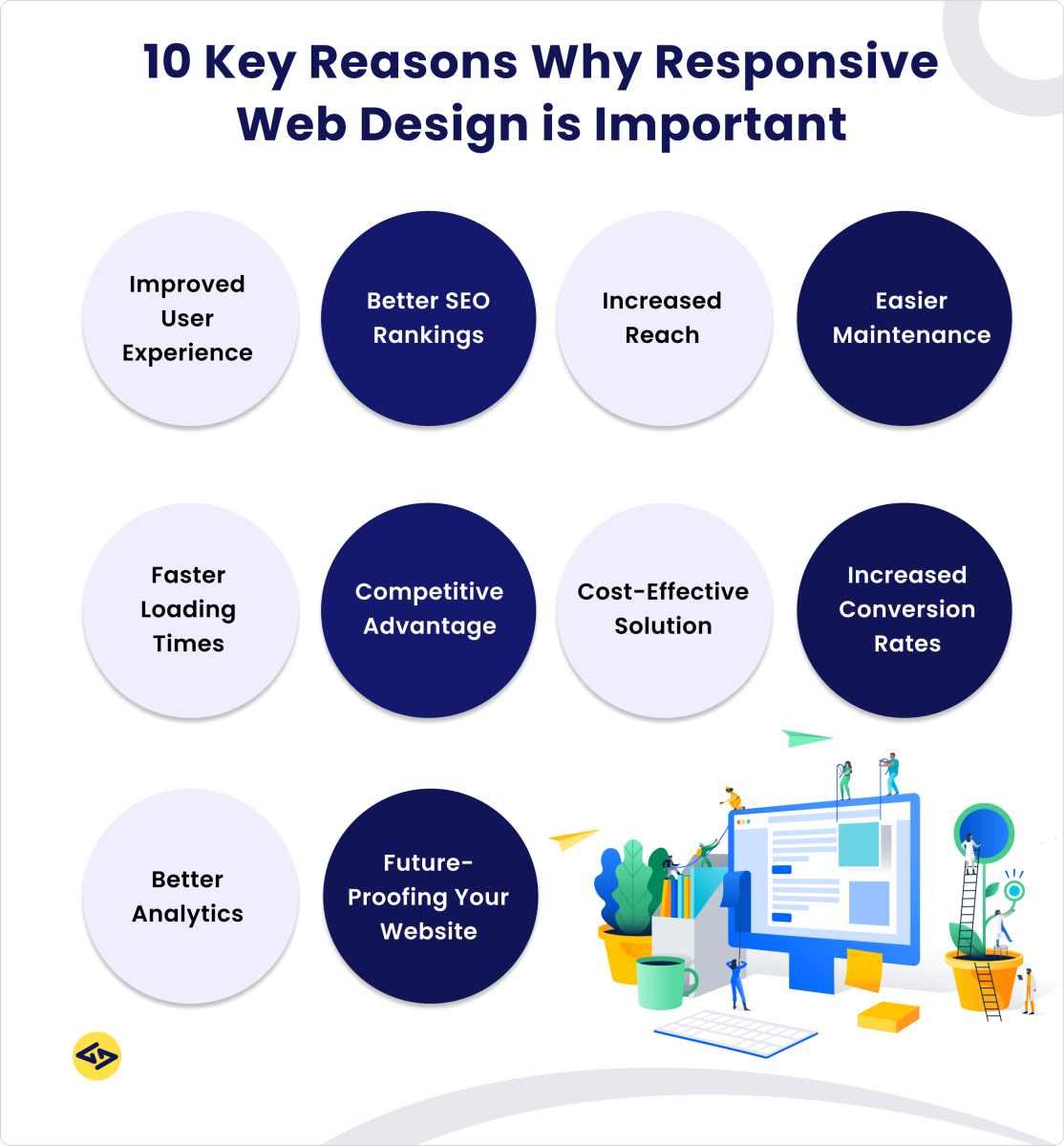
Why Is Responsive Web Design Important?
1. More Mobile Users Every Year
In Bangladesh and worldwide, most people now use mobile phones to browse the internet. According to Statista, over 60% of global website traffic comes from mobile devices. If your website is not mobile-friendly, you are missing a big part of your market.
Mobile usage has grown fast because smartphones are now affordable for almost everyone. In Bangladesh, even in small towns and villages, people use phones to shop, learn, and connect. They use Facebook, WhatsApp, and local online stores. If your business is not ready for mobile users, you are invisible to them.
Real Example
Suppose you run a clothing shop in Dhaka. A customer finds your website on their smartphone, but the site is slow and hard to use. They will leave and maybe buy from your competitor. With a responsive site, you keep that customer.
Let’s look deeper. Imagine a festival season like Eid or Puja. People are busy and want to shop quickly from their phones. If your site does not load well, you lose out during the most important sales days. Some studies show that 53% of mobile users leave a site if it takes longer than 3 seconds to load.
So, even a small delay can hurt your business a lot.
Another example: You run a restaurant. A hungry person searches for food near them using Google Maps or Facebook. If your menu or contact details are hard to read on their phone, they might skip your restaurant. But with a responsive site, they can see your address, menu, and phone number with one tap.
Insight: Many business owners focus only on desktop design because they use laptops themselves. But most of their customers use mobile phones. Always check your website statistics to see how many visitors come from mobile devices.
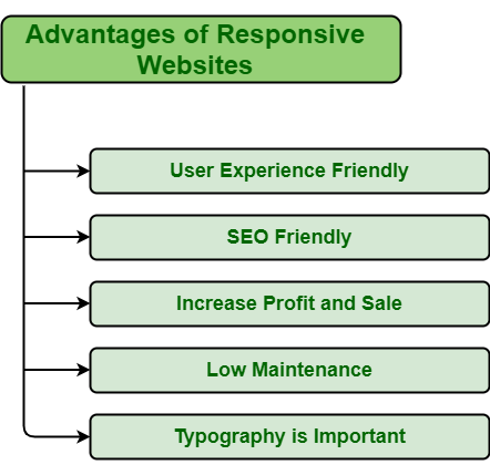
2. Better User Experience (ux)
A good experience keeps people on your site longer. They can easily find information, contact you, or buy your products. Bad user experience means customers leave quickly.
Responsive design gives:
- Easy navigation
- Clear content
- Fast loading pages
User experience (UX) is more than just pretty colors or nice photos. It’s about how people feel when using your website. Do they get frustrated? Or do they find what they want easily?
How Responsive Design Improves Ux
- Navigation Menus: On desktops, you may have a menu bar with many links. On mobile, these turn into dropdown menus or icons, so the page is not crowded.
- Content Readability: Paragraphs are not too wide on desktops and not too small on phones. This makes reading comfortable and reduces eye strain.
- Forms and Inputs: Contact forms or checkout pages are simple and use large fields on mobile. This helps users type easily, even with big fingers.
- No Horizontal Scrolling: Users hate scrolling left and right. Responsive design removes this problem.
- Consistent Branding: Your brand colors, logo, and style look good on every device, building trust.
Practical Example
A travel agency in Chittagong had a website with tiny links and small images. Customers kept calling to ask for basic info. After switching to a responsive design, calls dropped and online bookings doubled. Customers could find tour details, prices, and contact forms easily from their phones.
Non-Obvious Tip: Test your website with different users—young, old, tech-savvy, and beginners. Watch how they use it. You will learn a lot about what works and what doesn’t. Sometimes, a small change, like making the “Call Now” button bigger, can increase calls by 20% or more.
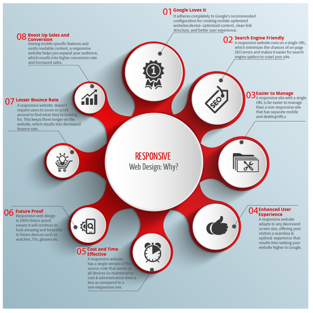
3. Higher Search Engine Ranking (seo)
Google and other search engines prefer mobile-friendly websites. In fact, Google uses “mobile-first indexing,” which means it checks your mobile site first for SEO ranking.
When your website is responsive, you get:
- Better SEO ranking
- More visitors from Google search
- More business opportunities
One Stop IT Solutions always builds websites with SEO and responsiveness in mind. This gives you a strong advantage over your competitors.
Why Does Seo Matter?
SEO means your website appears higher in Google results when people search for your product or service. For example, if someone types “best bakery in Dhaka,” you want your site to show up on the first page. Most users never go to the second page.
Responsive design helps SEO in several ways:
- One URL for All Devices: Google prefers one link for mobile and desktop. This makes it easy to share and track.
- Lower Bounce Rate: If users stay longer on your site, Google thinks your content is good. Responsive sites keep users happy, so they stay longer.
- Faster Loading Times: Google uses site speed as a ranking factor. Responsive sites can be made to load faster on mobile.
- Better Social Sharing: When people share your site on Facebook or Twitter, the link looks good on all devices.
Example
Let’s say you sell electronics. Your competitor’s website is not mobile-friendly, but yours is. Google will likely show your site higher in search results on mobile devices. This means more free traffic and more sales.
Non-Obvious Tip: SEO is not a one-time job. After launching your responsive site, keep updating your content, images, and services. Google likes fresh information.
4. Save Time And Money
Before responsive design, businesses made separate websites for mobile and desktop. This cost more money and time. Now, you only need one website that works everywhere.
Benefits:
- Lower web development cost
- Easier updates (change one site instead of two)
- Less headache for your team
The Old Way Vs. The New Way
In the past, a company might pay for a desktop website and a separate mobile site (like “m. yourbusiness. com”). This meant double the design, double the coding, double the updates, and double the cost. Even a small change—like updating a price—meant two edits.
With responsive design, you only have one website. You save money on hosting, design, and maintenance. You also reduce the chance of mistakes, like forgetting to update the mobile version.
Real Example
A school in Sylhet had two websites—one for desktop, one for mobile. When they changed their admission form, they forgot to update the mobile version. Many students could not apply and the school lost applicants. Now, with a responsive website, this problem never happens.
Non-Obvious Tip: When you plan your website budget, think about the long-term cost. Responsive design is a smart investment because you pay once and update easily for years.
5. Builds Trust And Professional Image
When customers see a website that works well on all devices, they trust your business more. It shows you care about their needs and you are serious about quality.
If your website looks broken on mobile, people may think your business is old-fashioned or not reliable.
Why Does Image Matter?
In today’s digital world, your website is your first impression. People judge your business in seconds. If your site looks modern and works well, they think you are serious and professional.
For example, a consulting firm with a sharp, responsive site is more likely to get clients than one with an outdated, broken website. People often check websites before calling or visiting in person.
More Than Looks
A good website also reduces customer doubts. If prices, services, and contact info are easy to find, customers feel safe. They are more likely to trust you with their money or sensitive information.
Non-Obvious Tip: Add trust signals, like real photos, client reviews, or certificates, in places that look good on mobile and desktop. Make sure these elements are visible without scrolling too much on mobile.
—
Responsive Design: Bangladesh Vs. International Market
Bangladesh Market
In Bangladesh, many people use budget smartphones and slower internet. This means your website must be light, fast, and easy to use on low-cost devices. Responsive design is very important for:
- Local e-commerce shops
- Service companies
- Educational institutions
Local User Habits
Bangladeshi users often use 3G or 4G networks, which can be slow, especially in rural areas. They may have older phones with small screens and less memory. Heavy websites with big images or fancy animations take too long to load.
Users do not wait—they leave.
Many people access Facebook through their phone’s browser, not through the app. So, if your website is not responsive, even your Facebook marketing will not work well.
Local Language And Fonts
Bangladeshi websites often use Bangla fonts or mixed language content. These must be readable on all devices. Responsive design helps text display clearly, whether in Bangla or English.
Case Study
A local grocery delivery service launched a responsive site. Before, most customers called by phone because the website was hard to use. After the upgrade, online orders doubled, and customer satisfaction improved.
Non-Obvious Tip: Always test your website on popular local phones, like Symphony or Walton models. Do not assume that what works on an iPhone will work everywhere in Bangladesh.
International Market
When you target customers in the USA, UK, or other countries, you face tough competition. Customers expect high-quality, modern websites. A non-responsive site can damage your brand and reduce your chances of getting international clients.
One Stop IT Solutions understands both local and global needs. We design websites that succeed in both markets.
Global User Expectations
International customers use many devices—iPhones, iPads, Androids, Windows laptops, and Macs. They have fast internet, so they expect smooth animations and high-quality images. But they also expect the site to be fast and error-free.
Competitor Pressure
In global markets, your competitor is often just one click away. If your site is slow or hard to use, customers will leave immediately. International buyers often check your website before trusting you with an order or partnership.
Example
A Bangladeshi IT company wanted to get clients from the USA. Their old website was slow on mobile and had small, unreadable text. After moving to a responsive site, they saw more international inquiries and signed their first client from Europe within three months.
Non-Obvious Tip: Use tools like Google Analytics to track which countries your website visitors come from and what devices they use. Optimize your site for the most common devices used by your target market.
—
Key Features Of A Responsive Website
1. Flexible Layouts
The website layout changes based on screen size. For example, three columns on desktop, but one column on mobile.
A flexible layout uses “percentages” or “relative units” instead of fixed sizes. This allows your site’s sections to grow or shrink depending on the device. For example, a product gallery with three items in a row on desktop becomes a single column on mobile, making each product easy to view.
Example
A news portal has sidebars on desktop but removes them on mobile, showing only the main article. This keeps the page simple and readable.
2. Responsive Images
Images automatically resize to fit the device. No more cut-off pictures or slow loading times.
Responsive images use techniques like “srcset” or CSS max-width. This means you can show a small image for mobile and a large one for desktop, saving data and loading time.
Example
An online bakery uploads a cake photo. On mobile, users see a smaller, compressed version. On desktop, they see a bigger, detailed image.
Non-Obvious Tip: Use modern image formats like WebP for faster loading. Also, always add “alt” text to images for better SEO and accessibility.
3. Easy-to-read Text
Text size adjusts for every device. Users do not need to zoom in or squint.
Good responsive design uses readable fonts, proper line spacing, and enough contrast between text and background. This is especially important for users with vision problems or for reading in sunlight.
Example
A school website shares exam results. On mobile, the text is large and clear, making it easy for students and parents to read quickly.
Non-Obvious Tip: Avoid using fancy or script fonts for body text. Stick to simple fonts like Arial, Roboto, or Open Sans for clarity.
4. Touch-friendly Buttons
Buttons and menus are easy to tap on mobile screens. No tiny links or hard-to-click areas.
On mobile, fingers are less precise than a mouse. Responsive sites use big, clear buttons with enough space around them. This reduces mistakes and makes navigation smooth.
Example
A food delivery app’s “Order Now” button is big and colorful, so users can tap it easily even when hungry or in a hurry.
Non-Obvious Tip: Place the most important buttons, like “Call,” “Buy,” or “Book Now,” within easy reach of a thumb on mobile screens.
5. Fast Loading Speed
A responsive site loads quickly, even on slow mobile networks. This is important for users in Bangladesh with limited internet speed.
Fast loading improves user experience and SEO. Compress images, minimize code, and use caching to keep your site light.
Example
An online bookstore uses small images and simple design. Even users with 3G can browse and buy books without waiting.
Non-Obvious Tip: Use lazy loading for images so that pictures only load when the user scrolls down, saving data and speeding up the page.
—
Practical Tips For Making A Website Responsive
1. Use A Mobile-first Approach
Design for mobile screens first, then adjust for bigger screens. This way, your site works perfectly for the largest group of users.
Why Mobile-first?
Most people now visit websites from mobile phones. Designing for mobile first means your site is simple, fast, and focused. When you expand to desktop, you can add more features.
Example
Start with one column for content and add more columns for desktop views.
Pro Tip: Sketch your mobile layout on paper before starting the desktop design.
2. Test On Real Devices
Don’t just use a computer. Check your site on different smartphones, tablets, and laptops.
Why Test On Real Devices?
Emulators and browser tools help, but real devices show real problems. For example, a button that looks fine on your laptop might be hard to tap on a small Android phone.
Example
Ask your friends or team to open your site on their phones and give feedback.
Pro Tip: Test with old and new devices, both Android and iPhone, and check with different browsers like Chrome, Firefox, and Safari.
3. Optimize Images
Use small, compressed images so your site loads fast. Tools like TinyPNG can help.
Why Optimize?
Large images slow down your website, especially on mobile. Compressed images look almost as good but are much smaller in size.
Example
A real estate site uses TinyPNG to shrink property photos by 70%, making the gallery load in seconds.
Pro Tip: Use “responsive” image tags in your HTML so the browser picks the best image size for each device.
4. Choose Readable Fonts
Pick simple, clear fonts that are easy to read on small screens.
Why Simple Fonts?
Fancy fonts can be hard to read, especially on small screens. Choose fonts with good spacing and high contrast.
Example
An online tutoring site uses Open Sans for all text, making lessons easy to read on phones and tablets.
Pro Tip: Use a font size of at least 16px for body text on mobile.
5. Make Buttons Big Enough
Make sure buttons and links are easy to tap with a finger.
Why Big Buttons?
Small buttons frustrate users and lead to mistakes. Big buttons make the site feel modern and friendly.
Example
A taxi booking site uses large “Book Now” and “Call Driver” buttons at the bottom of the screen for easy access.
Pro Tip: Leave at least 8 pixels of space around buttons so users don’t tap the wrong one.
6. Avoid Pop-ups On Mobile
Pop-ups can be hard to close on mobile and may annoy users. Use them carefully.
Why Avoid Pop-ups?
Pop-ups block content and sometimes make users leave. If you must use them, make sure they are easy to close and do not cover the whole screen.
Example
A news site uses a small pop-up at the bottom with a “Subscribe” offer, and it can be closed with one tap.
Pro Tip: Google may penalize mobile sites with annoying pop-ups, so keep them simple.
7. Use Responsive Frameworks
Frameworks like Bootstrap or Foundation make it easier to build responsive sites. One Stop IT Solutions uses these tools to save you time and money.
Why Frameworks?
Responsive frameworks have built-in grids, buttons, and forms that look good on all devices. They help you avoid common mistakes and speed up development.
Example
A startup uses Bootstrap to launch a new product site in just one week, with a layout that works everywhere.
Pro Tip: Customize the framework to match your brand’s colors and style, so your site doesn’t look like everyone else’s.
—
Real-world Example: Success Story
A Dhaka-based electronics shop contacted One Stop IT Solutions. Their old website was not responsive, and sales were low. After we built a new responsive website:
- Mobile sales increased by 45%
- Bounce rate (people leaving quickly) dropped by 30%
- Customer feedback improved a lot
Now, they are growing both in Bangladesh and getting new orders from abroad.
More Details
Before the redesign, most visitors came from mobile devices, but only a small number completed a purchase. Customers complained that the product images were too small, the “Add to Cart” button was hard to find, and checkout forms were confusing on phones.
What Changed:
- The new site used bigger product images that adjusted to all screens.
- The “Add to Cart” and “Buy Now” buttons were large and placed in easy-to-find spots.
- The checkout process was simplified to just three steps, with big text fields and clear instructions.
Result: Within three months, the store saw a 45% increase in mobile sales and a 30% drop in bounce rate. International buyers from the UK and UAE also started placing orders because the site looked professional and worked smoothly on any device.
Customer Feedback: “Our clients now tell us they can shop easily from their phones, and we get more positive reviews. It feels like we run a modern business.”
—
Comparison: Responsive Vs. Non-responsive Website
Below is a comparison to help you understand the difference:
| Feature | Responsive Website | Non-Responsive Website |
|---|---|---|
| Works on all devices | Yes | No |
| SEO Friendly | Yes | No |
| Cost-effective | Yes | No (may need two sites) |
| User Experience | Excellent | Poor on mobiles |
| Sales Conversion | Higher | Lower |
Additional Comparison Points
- Maintenance: Responsive sites are easier to update, saving time and effort.
- Brand Image: Responsive sites look modern; non-responsive sites look outdated.
- Customer Support: Responsive sites reduce customer complaints about usability.
Non-Obvious Tip: Even if your business is small, a non-responsive site can make you look less trustworthy. First impressions matter online.
—
Two Non-obvious Insights For Business Owners
- Small Design Problems Can Cause Big Losses: Even a simple issue—like a button not working on mobile—can make you lose sales every day. Many owners do not test their site on real phones. Always test on real devices!
- For example, a “Contact Us” link that is not clickable on mobile can reduce calls and emails. These small issues are often missed if you only check your site on a computer.
- Google Can Penalize Non-Responsive Sites: If your website is not mobile-friendly, Google may show your competitor’s site before yours in search results, even if your business is better. This is a silent loss many do not notice.
- Google’s algorithm changes often, but mobile-friendliness remains a key factor. You may keep losing traffic and sales without even knowing the reason.
Extra Insight: Responsive design is also important for social media marketing. When you share a link on Facebook or WhatsApp, the preview and page must look good on mobile, or people will not click.
—
Why Choose One Stop It Solutions?
There are many web development companies, but One Stop IT Solutions stands out for several reasons:
- Trusted: Hundreds of happy clients in Bangladesh and abroad
- Affordable: Quality web design at a price you can afford
- Expert: Skilled team in responsive design, SEO, and modern web technology
- Support: Fast, friendly support when you need it
We make sure your website is not only responsive but also SEO optimized, secure, and ready for business growth.
More About Our Services
- We use the latest tools and frameworks for speed and reliability.
- We offer free training to help your team manage and update the website.
- We provide ongoing support and maintenance so your site stays up-to-date.
- We help you with digital marketing, so your new site gets more visitors.
Non-Obvious Tip: We include accessibility checks, so your website is easy to use for everyone, including people with disabilities. This is important for building trust and reaching a wider audience.
—
How To Start Your Responsive Website Project
- Contact One Stop IT Solutions: Share your ideas and needs.
- Get a Free Consultation: We will suggest the best plan for your business.
- See a Demo: We show you how your responsive site will look.
- Launch Your Website: Start getting more customers, both locally and internationally.
More Details On The Process
- We begin with a discovery call to understand your goals.
- Our team prepares a simple mockup for your feedback.
- We work in clear steps, so you always know what’s happening.
- After launch, we monitor your site to make sure it works well on all devices.
- We offer free basic changes for the first three months to keep your site perfect.
Non-Obvious Tip: Good communication is key. Always share your feedback early, so we can make changes before the site goes live.
—
Frequently Asked Questions
What Is The Main Benefit Of Responsive Web Design?
Responsive web design means your website works well on any device—mobile, tablet, or desktop. The main benefit is that all your customers get a good experience, which leads to more sales and better reputation.
Extra Details
- Your website is ready for the future, as new devices keep coming.
- You reach more people, including those who only use mobile phones.
How Does A Responsive Website Help With Seo?
Google prefers mobile-friendly websites. If your site is responsive, it will rank higher in search results. This brings more visitors and potential customers to your business.
Extra Details
- Responsive sites load faster, which is good for SEO.
- One website means all your SEO work helps both mobile and desktop users.
Is A Responsive Website Expensive?
No. A responsive site is often cheaper in the long run. You only need one website, not two. One Stop IT Solutions offers affordable packages for all types of businesses.
Extra Details
- You save money on updates and hosting.
- Your site lasts longer before needing a redesign.
Can I Upgrade My Old Website To Be Responsive?
Yes. In most cases, your old site can be redesigned to become responsive. Our team can check your current site and suggest the best solution.
Extra Details
- We do a free audit and show you exactly what needs to change.
- Most redesigns take just a few weeks, not months.
How Do I Know If My Website Is Responsive?
Open your site on different devices (mobile, tablet, desktop). If it looks good and works smoothly everywhere, it is responsive. You can also use Google’s Mobile-Friendly Test online to check.
Extra Details
- Check if you need to zoom in or scroll sideways. If yes, your site is not responsive.
- Ask friends or staff to test and give honest feedback.
—
Responsive web design is not optional anymore—it is a must for every business that wants to grow. Whether you are targeting customers in Bangladesh or abroad, a responsive website gives you more visitors, better sales, and a stronger brand.
Ready to upgrade your website? Trust One Stop IT Solutions—the expert, affordable, and trusted web development & SEO company.
👉 Website: [onestopitbd.com](https://darkblue-curlew-445621.hostingersite.com)
👉 Email: Contact@darkblue-curlew-445621.hostingersite.com
👉 Whatsapp: +8801914119584
Contact us today and take your business to the next level!
For more details about responsive design, you can also read this Wikipedia article.