If your website confuses visitors, you lose customers before they even read your story. In today’s digital world, website navigation is more than just “menus.” It’s the secret tool that guides visitors, builds trust, and turns clicks into sales. Whether your business is in Bangladesh or you’re reaching the global market, simple navigation can be your key to success.
Let’s explore how smart website navigation helps both local and international businesses—and learn practical tips to improve your site, starting today.
—
Why Website Navigation Matters For Business
Imagine entering a big supermarket with no signs, no directions, and products in random places. You’d feel lost, right? The same happens when visitors land on a website with poor navigation. People leave quickly, and your sales drop.
Good navigation means:
- Visitors find what they want easily
- Your business looks professional and trustworthy
- Search engines (like Google) understand your site better, so you rank higher
But what does this look like in real life? Picture a visitor coming to your site to buy a specific product or service. If they can’t find it in a few seconds, they’ll leave and probably never come back. This is especially true for first-time visitors who don’t know your brand yet.
For example, let’s say you run an electronics shop in Dhaka. Someone searches for “best budget smartphones” and lands on your site. If your navigation is clear, they can find your “Smartphones” category, filter by price, and see your best offers.
But if your menu is crowded or unclear, they’ll get frustrated and click away.
Trust plays a big role too. People feel safer buying from sites where everything is easy to find. When your website looks organized, customers believe your business is reliable.
Search engines also notice. Google’s “crawlers” explore your site by following links, just like a human visitor. If your navigation is messy, Google can miss important pages. This means your products or services might not show up in search results—even if you’re the perfect fit for the customer.
In Bangladesh, many companies miss out because their websites are confusing. International buyers expect clear, simple navigation. If they can’t find your products or services, they will go somewhere else. This is not just about sales—it’s about reputation. A confusing website can harm your brand image.
One Stop IT Solutions always builds websites with user-friendly navigation—helping businesses grow locally and worldwide. Over the years, we’ve seen that even small changes in navigation can double or triple the number of online leads. For example, one client saw a 60% increase in inquiries after we reorganized their menu and added a clear search bar.
Non-obvious Insight: Navigation Builds Credibility
Many business owners focus on the look of their website (colors, images, etc. ), but forget how important navigation is for credibility. If your navigation matches what users expect, they’ll trust you more—especially if they’re buying from Bangladesh for the first time.
Non-obvious Insight: Navigation Impacts Return Visits
Easy navigation isn’t just for first-time visitors. When people can quickly find what they want, they’re more likely to return. Repeat visitors are the backbone of online business growth. Good navigation helps turn one-time buyers into loyal customers.
—
Main Principles Of Effective Website Navigation
Designing effective navigation is both an art and a science. Let’s look at the most important principles and see how to use them on your website.
1. Keep It Simple
Don’t use complicated menus or too many choices. A simple, clear menu is easy for everyone, even non-technical users. Limit main menu items to 5–7. For example:
- Home
- About Us
- Services
- Portfolio/Products
- Contact
Why is this important? Studies show that when people see too many choices, they get “decision fatigue. ” They can’t decide where to click, so they leave. This is called the “Paradox of Choice. ” Even big companies like Amazon and Apple use simple main menus.
A simple menu also helps on mobile phones, where space is limited. If you have too many items, your menu will look crowded and hard to use.
Examples
- A restaurant website might use: Home, Menu, Order Online, Locations, Contact.
- A school website could use: Home, About, Admissions, Academics, Contact.
Notice how each menu item is clear and covers a broad area. Detailed pages can go in dropdown menus.
Practical Tip
Before adding a new menu item, ask: “Does this need to be in the main menu, or can it go under another section?” Less is more.
2. Use Clear Labels
Choose menu names that match what people search for. Avoid creative, confusing words. Use “Services” instead of “What We Do. ” Use “Products” not “Our Creations. ”
Clear labels help both users and search engines. When someone sees “Shop” or “Store,” they know it’s for buying products. If they see “Experience” or “Journey,” they might not know what you mean.
Examples
- Instead of “Our Innovations,” use “Products.”
- Instead of “Our Story,” use “About Us.”
- Instead of “Get In Touch,” use “Contact.”
This is especially important for businesses in Bangladesh that want to reach international clients. Use simple English words, as many visitors are not native speakers.
Practical Tip
Test your menu labels with real users. Ask them, “What do you think you’ll find if you click here? ” If they’re unsure, the label isn’t clear enough.
3. Make Navigation Consistent
Menus should be in the same place on every page. Most websites use the top or left side. Don’t move the menu or change its style from page to page.
Consistency builds trust. When people know where to look for the menu, they feel comfortable exploring more pages.
Examples
- Keep the main menu at the top on all pages.
- If you use a sidebar menu, keep it on the left side everywhere.
- Use the same colors and fonts for all menu items.
If your menu moves around, people get confused and might think they’ve left your site by mistake. Consistency is key for both branding and usability.
Practical Tip
Check your site on different pages. Is the menu always in the same place? If not, fix it. Small changes in layout can confuse visitors more than you think.
4. Highlight The Current Page
Show users where they are. For example, use a different color or underline the menu item for the current page. This helps visitors know their location on your site.
When someone visits “About Us,” that menu item should look different—maybe a bold font or colored background. This simple trick makes navigation feel easy and safe.
Examples
- If “Services” is selected, highlight it in blue while the rest stay gray.
- Underline the current page in the menu.
- Use a small arrow or icon next to the active page.
Practical Tip
Don’t overdo it—one highlight is enough. Too many colors can look messy. The goal is to gently show the current page without distracting users.
5. Mobile-friendly Navigation
Over 60% of website visits in Bangladesh now come from mobile devices. Use responsive menus that work well on small screens. Hamburger menus (three lines) are common for mobile navigation.
Mobile users have less patience. If your navigation doesn’t work on a phone, you’ll lose customers fast. Responsive design means your menu adapts to any screen size, so it’s always easy to use.
Examples
- Use a hamburger icon for mobile menus.
- Make menu buttons large enough to tap easily.
- Keep dropdown menus simple for touch screens.
Google also checks if your navigation is mobile-friendly. Sites that work well on phones rank higher in search results.
Practical Tip
Test your site on different phones and tablets. Ask friends or employees to try it, too. Look for small buttons, menus that are hard to open, or items that don’t fit on the screen.
—
Practical Tips To Improve Your Website Navigation
Good navigation doesn’t happen by accident. Here are practical steps you can use to fix and improve your site—today.
Use A Logical Structure
Arrange your pages in a clear order. Start from the most general (Home) to the most specific (Product Details). Here’s a simple structure:
| Main Menu | Submenu Example |
|---|---|
| Home | – |
| Services | Web Design, SEO, IT Consulting |
| Portfolio | Client Projects, Case Studies |
| Contact | Contact Form, Location Map |
This kind of structure helps users “drill down” from a broad topic to detailed information. It also helps search engines understand how your pages connect.
Example
For an e-commerce website:
- Home
- Shop
- Men’s Clothing
- T-Shirts
- Shirts
- Women’s Clothing
- Sarees
- Kurtis
- About Us
- Contact
With this setup, shoppers can easily move from the main shop page to exactly what they want.
Practical Tip
Draw a “site map” on paper before building your menu. Start with main sections, then add sub-pages under each one. This helps you see if the structure makes sense.
Add A Search Bar
A search bar helps users quickly find products or information, especially on large sites. Make sure the search is easy to see, usually at the top right.
For small business sites, a search bar might seem unnecessary. But as your site grows, it becomes critical. People who use search bars are often ready to buy—they know what they want.
Example
- A bookstore website: Someone types “Python programming” and finds all related books.
- A travel agency: A visitor searches for “Cox’s Bazar” and instantly finds tour packages.
Non-obvious Insight
Make sure your search can handle typos and similar words. For example, if someone searches “t-shrit” instead of “t-shirt,” they should still get results. This requires a smart search function, but it’s worth the effort.
Practical Tip
Test your search bar with common keywords. If it doesn’t find the right pages, update your search settings or talk to your web developer.
Use Breadcrumbs
Breadcrumbs are a small menu (like Home > Services > SEO) showing the path to the current page. This helps users go back easily and helps Google understand your site.
Breadcrumbs are especially useful for large or complex websites. They give users a “map” so they never feel lost.
Example
- Home > Shop > Men’s Clothing > T-Shirts
A user can click “Shop” to see all categories, or “Men’s Clothing” to see all men’s products.
Non-obvious Insight
Breadcrumbs can also improve your Google search results. Sometimes, Google shows breadcrumbs under your website link in search, making your site look more organized and professional.
Practical Tip
Add breadcrumbs near the top of every page, just below your main menu. Keep them simple—don’t add extra words or links.
Include A Clear Call To Action
Every page should tell visitors what to do next. For example, “Contact Us for a Free Quote” or “See Our Portfolio. ” Place these links where users can see them easily.
A call to action (CTA) is a button or link that tells users their next step. Without CTAs, visitors might read your site but never take action.
Examples
- On a service page: “Request a Free Consultation”
- On a product page: “Buy Now” or “Add to Cart”
- On a blog post: “Subscribe to Our Newsletter”
Non-obvious Insight
CTAs should match the visitor’s stage. For new visitors, “Learn More” works better than “Buy Now. ” For returning users, a stronger CTA like “Start Your Free Trial” is better.
Practical Tip
Use bright colors for CTAs, but only one main color per page. Place CTAs at the top, middle, and bottom of important pages.
—
Common Navigation Mistakes (and How To Avoid Them)
Even experienced web designers make mistakes. Here are the most common problems—and how to fix them.
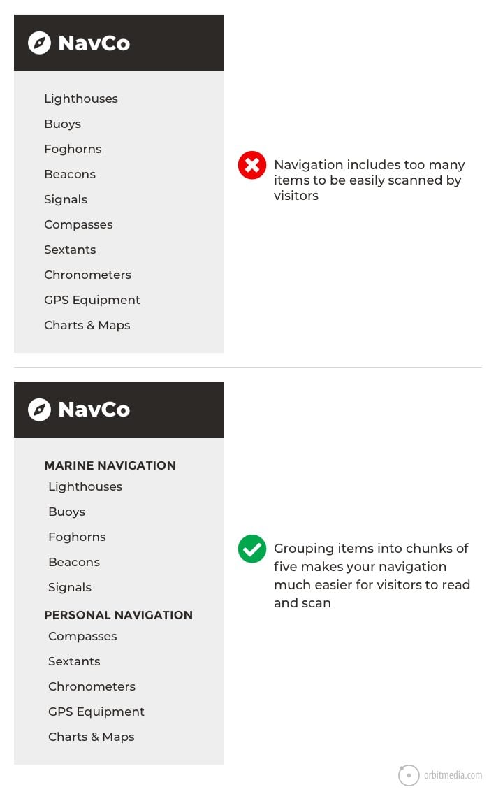
1. Too Many Menu Items
If your menu has 10+ choices, users feel lost. Group similar items under dropdown menus.
- Example: Instead of listing every service, use one “Services” menu with a dropdown.
- Fix: Review your main menu. Remove or group items until you have 5–7 main choices.
- Hidden Menus
Don’t hide important links. Keep top services/products visible in the main menu.
- Example: If “Contact” is hidden in a submenu, some users won’t find it.
- Fix: Move high-traffic pages to the main menu.
- Unclear Labels
Fancy names confuse users. Use simple, direct words.
- Example: “Our Journey” is less clear than “About Us.”
- Fix: Ask non-technical people to review your menu labels. If they’re unsure, change the names.
- Dead Links
Broken or missing links make your business look unprofessional. Check and fix links regularly.
- Example: Clicking “Shop” leads to a 404 error. This damages trust.
- Fix: Use a tool like Broken Link Checker to scan your site every month.
- Overcomplicated Design
Too many colors, animations, or moving parts distract visitors. Clean, simple navigation works best.
- Example: Animated menus look nice but are slow on old phones.
- Fix: Use simple colors and smooth transitions. Test on slow devices.
Extra Mistakes To Watch Out For
6. No ‘back To Top’ Button
On long pages, users have to scroll up manually. Add a small button that lets them jump to the top easily.
7. Inconsistent Menu Order
Changing the order of menu items on different pages confuses visitors. Keep the same order everywhere.
8. Missing Home Link
Some sites remove “Home” from the menu, thinking it’s obvious. But not all users know clicking the logo goes home. Always include a “Home” link.
9. No Visual Feedback On Click
If users click a menu item and nothing changes (no highlight, no animation), they may think the site is broken. Always give feedback.
10. Menus That Disappear Too Quickly
Dropdown menus that close if you move the mouse by mistake are frustrating. Set a short delay before closing.
Common Navigation Myths
- “More options are better.”
Reality: More choices slow users down.
- “People will search if they can’t find it.”
Reality: Most users leave before searching.
- “Creative labels make us stand out.”
Reality: Unfamiliar words make users leave.
—
Real-world Examples
Learning from other businesses can help you see what works—and what doesn’t.
Bangladeshi Business Example
A popular online clothing store in Dhaka improved sales by 35% after switching to a simple menu: Home, Shop, About, Contact. Customers found products faster, and more orders came in.
More Details
Before the change, the site had menus like “Our Collections,” “Festive Picks,” “Style Hub,” and “Reach Us. ” Many customers could not find the main shop page. After switching to “Shop” and “Contact,” confusion dropped. The “Shop” menu led to categories like “Men,” “Women,” and “Kids,” each with clear subcategories.
The store also added a search bar and breadcrumbs. As a result:
- Bounce rate dropped from 62% to 41%
- Average time on site increased by 1.5 minutes
- Customer support requests about “how to order” went down by 50%
This shows that clear navigation doesn’t just increase sales—it also saves time for your team.
International Market Example
A software company targeting US clients used clear navigation (“Solutions,” “Industries,” “Contact Us”) and added a search bar. Their bounce rate dropped by 20%, and international leads increased.
More Details
Before updating their navigation, the company used creative labels like “Our Toolbox” and “Get in Touch. ” Many visitors left without contacting them.
After the change:
- “Solutions” menu listed all software products
- “Industries” showed case studies for each market
- “Contact Us” was always visible
They also added a “Request a Demo” button on every page. This led to:
- 30% more demo requests from US and UK visitors
- Higher trust from international clients (measured in post-sale surveys)
- Better Google rankings for keywords like “custom ERP solutions”
Bonus Example: Non-profit Website
A Bangladeshi education non-profit had a complex site with many programs and projects. Volunteers struggled to find resources. After simplifying their menu to “About Us,” “Programs,” “Get Involved,” and “Contact,” volunteer sign-ups increased by 40%.
Key Lesson
Simple navigation helps all types of organizations—not just e-commerce or tech companies.
—
How Website Navigation Boosts Seo
Search engines like Google love well-structured websites. Good navigation helps your pages get indexed and ranked higher.
- Internal links (links to your own pages) spread “SEO power” across your site.
- Clear menus help Google understand which pages are most important.
- Breadcrumbs and sitemaps make crawling easier.
Let’s look deeper.
Internal Links
When your menu links to key pages, Google sees those pages as important. If you link to your “Services” page from every menu, Google knows it’s a main part of your business.
But you can also add internal links inside your content. For example, on your “Web Design” page, add a link to “SEO Services. ” This helps both users and search engines discover more pages.
Menus And Page Importance
The higher a page is in your menu, the more important Google thinks it is. If you hide a service in a submenu or deep in your site, it might not rank well.
Breadcrumbs And Sitemaps
Breadcrumbs help Google see how your site is organized. They also make your links look better in search results.
A sitemap is a special file that lists all your pages. It helps Google find and index every part of your site. Good navigation makes it easier to build a clear sitemap.
Bonus: Site Speed And Navigation
Simple navigation loads faster. Fast sites rank higher in Google. Over-complicated menus can slow your site down, especially on mobile devices.
Non-obvious Insight: Navigation Impacts “dwell Time”
“Dwell time” is how long visitors stay on your site after clicking from Google. Good navigation keeps people exploring more pages. The longer they stay, the better your SEO performance.
Non-obvious Insight: Navigation Reduces “pogo Sticking”
“Pogo sticking” happens when users click your site in Google, then quickly leave and return to the results. This signals to Google that your site didn’t help. Clear navigation keeps users engaged, reducing pogo sticking.
For More About How Site Structure Helps Seo, Check Out [google’s Seo Starter Guide](https://developers.google.com/search/docs/fundamentals/seo-starter-guide).
—
Website Navigation For Local And Global Success
Your website should work for both local customers in Bangladesh and international clients.
For Bangladeshi Businesses
Local customers may use slower internet or older devices. Fast, easy navigation improves their experience. Use simple menus and test on different phones.
Practical Steps
- Avoid heavy images or complex animations in menus.
- Test your site on 2G/3G networks.
- Use Bengali and English for menu labels if your audience prefers local language.
Example
A grocery delivery site in Chattogram doubled mobile orders by simplifying its menu and speeding up page load times.
For International Clients
Foreign buyers expect world-class navigation. Use English, clear labels, and fast-loading menus. Follow global best practices so international customers trust your brand.
Practical Steps
- Check competitor websites in your target market. Copy their navigation style, not just the design.
- Make sure all menu items are in simple, easy-to-understand English.
- Use currency converters and country selectors if you serve multiple countries.
Example
A handicrafts exporter added a “Shop by Country” menu and saw orders from Europe and the US increase by 50%.
Non-obvious Insight: Local Context Matters
What works in Dhaka may not work in New York. Local buyers may prefer “Cash on Delivery” links in the menu, while international buyers look for “Secure Checkout” or “PayPal” options.
Non-obvious Insight: Accessibility
International standards require navigation to be usable by people with disabilities. Use proper contrast, big enough buttons, and keyboard navigation. This is not only good practice—it can also open up new markets.
—
Quick Checklist For Great Website Navigation
You can use this checklist before launching your site or after updates:
- Limit main menu to 5–7 items
- Use clear, common words
- Keep navigation in the same place
- Highlight current page
- Make it mobile-friendly
- Add a search bar for big sites
- Use breadcrumbs for easy backtracking
- Regularly check for broken links
- Include a “Home” link
- Test navigation on different devices and browsers
- Make buttons large enough for touch screens
- Use proper contrast for readability
- Group similar items under dropdowns
- Add a “Back to Top” button on long pages
- Use visual feedback (highlight, animation) on clicks
Pro Tip
Ask 3–5 people who have never seen your site to try finding a product or service. Watch what confuses them. Update your navigation based on their feedback.
—
Why Choose One Stop It Solutions?
One Stop IT Solutions is a trusted, affordable, and expert web development & SEO company in Bangladesh. Our team understands both local and international markets. We build websites that:
- Are easy to use
- Look professional
- Bring real business results
We focus on simple, strong navigation. From small businesses to large exporters, our solutions help you grow online—without breaking your budget.
What Makes Us Different?
- Research-Based Design: We study your audience and competitors to build navigation that works for your business.
- Local and Global Experience: We know what Bangladeshi customers want—and what international buyers expect.
- SEO Expertise: Our navigation structures are built for both users and Google, boosting your site’s search rankings.
- Mobile-First Thinking: Every menu and link is tested on phones, tablets, and computers.
- Continuous Support: We don’t just build your site—we help you update and improve navigation as your business grows.
Results You Can Expect
- More visitors exploring your site
- Higher sales and leads
- Fewer support requests (“I can’t find…?”)
- Better Google rankings
- A website you’re proud to share with anyone
Our Process
- Analysis: We review your existing navigation, analytics, and user feedback.
- Planning: We create a clear site map and menu structure.
- Design: We build simple, modern menus for all devices.
- Testing: We test with real users and fix any problems.
- Launch: We go live and monitor your results.
Testimonials
> “Our online orders doubled after One Stop IT Solutions fixed our confusing menu. Now, even new visitors find what they need in seconds. ” — Local clothing retailer
> “We got our first US client after updating our navigation. The new menu made us look professional and trustworthy. ” — Dhaka-based software company
—
Frequently Asked Questions
What Is Website Navigation?
Website navigation is the system of menus and links that helps visitors move between pages on your website easily. It’s like signs and maps in a shopping mall—showing users where to go.
Why Is Simple Navigation Important For My Business?
Simple navigation helps customers find information quickly, builds trust, and increases sales. It also helps your site rank higher on Google. If people can’t find what they need, they leave—and you lose business.
How Can I Check If My Website Navigation Is Effective?
Ask real users to find products or services on your site. If they get confused or lost, your navigation needs improvement. You can also use tools like Google Analytics to see where users drop off your site.
Should I Use The Same Navigation For Mobile And Desktop?
Yes, but make sure the menu adapts to small screens (responsive design). Use a hamburger menu for mobile if needed. Test menus on different devices to be sure they work everywhere.
How Can One Stop It Solutions Help My Business?
We design websites with clear, user-friendly navigation. This helps attract more customers and grow your business both in Bangladesh and internationally. We also offer training so you can update menus yourself.
How Often Should I Update My Navigation?
Review your navigation every 6–12 months, or whenever you add new products or services. User habits and technology change—keep your site up to date.
What If I Want To Add More Pages Later?
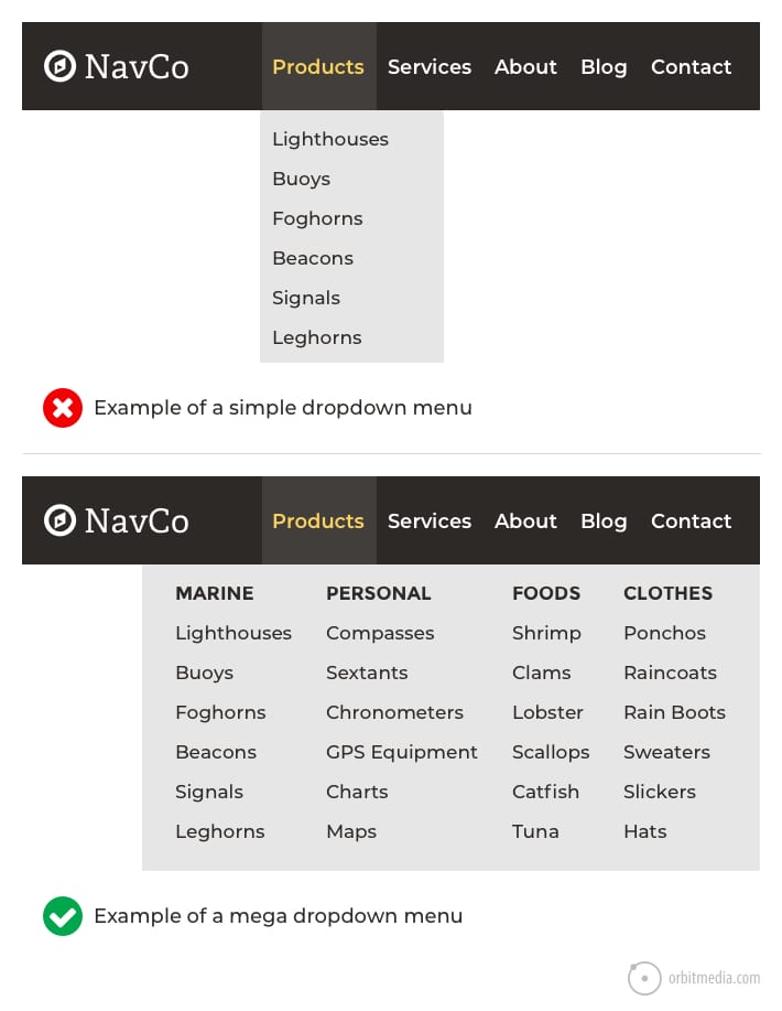
Group new pages under existing menu items, or use dropdowns. Don’t add too many items to the main menu. If your site gets very large, consider a “mega menu” or advanced search.
Can Good Navigation Help With Online Advertising?
Yes! Clear navigation means people who click ads can easily find what was promised. This improves your ad results and lowers your cost per click.
—
Ready to make your website easy and powerful? Trust the experts at One Stop IT Solutions.
👉 Website: [onestopitbd.com](https://darkblue-curlew-445621.hostingersite.com)
👉 Email: Contact@darkblue-curlew-445621.hostingersite.com
👉 Whatsapp: +8801914119584
Your Business Deserves The Best Online Presence—let’s Build It Together!