
In today’s digital world, your website is often the first thing customers see about your business. Whether you are working in Bangladesh or serving the international market, a good website is not just about looking beautiful. It must be easy to use, fast, and help your visitors find what they want quickly. If your website is confusing or slow, many people will leave and never come back. This is a big problem for any business.
But there is a solution. By following the right UI/UX design principles, you can make your website more attractive and user-friendly. This means more visitors, more sales, and a better reputation for your business. In this article, you will learn simple but powerful tips to improve your website’s design, see real examples, and understand why working with an expert company like One Stop IT Solutions can give you an edge in both the local and global market.
What Is Ui/ux Design?
Before we go into the principles, let’s understand what UI and UX mean.
- UI (User Interface): This is how your website looks. It includes colors, fonts, buttons, images, and the arrangement of everything on the page.
- UX (User Experience): This is how people feel when they use your site. Is it easy to find information? Is the process smooth? Do they enjoy using it?
A great website needs both good UI and good UX. If your site looks nice but is hard to use, you will lose visitors. If it is easy to use but ugly, people may not trust your brand. You need balance.
UI/UX is more than just creating a pretty homepage or using trendy colors. It’s about understanding the journey your visitor takes from the moment they land on your site, what they want to do, and how easily they can do it.
For example, a shop owner in Dhaka wants customers to find products and buy them quickly, while an international B2B service needs clients to understand their offers and get in touch with no confusion.
User Interface (UI) covers every visual element. For example, the “Add to Cart” button, the navigation bar, and even the way a form is styled. Bad UI can mean buttons are hard to find or read, colors are too bright, or the site looks old-fashioned.
User Experience (UX) is about how the visitor feels. Is your checkout process frustrating? Do people get lost looking for your contact number? Or do they find what they need easily and feel confident in your business?
Most beginners miss that UI and UX are not only for big companies. Even small local businesses in Bangladesh—like a bakery or a repair shop—can benefit from a better UI/UX. Good UI/UX is for everyone who wants more customers and happier clients.
Why Ui/ux Matters For Business Websites
A well-designed website can help you:
- Build trust with customers (very important for new brands)
- Increase sales by making it easy for visitors to buy or contact you
- Stand out from your competitors
- Work better on all devices (mobile, tablet, desktop)
- Rank higher on Google (SEO is linked to good UX)
Let’s see how you can achieve this with practical steps.
Trust Is Everything Online
Imagine you are buying a service or product online for the first time. If the website looks old, has spelling mistakes, or is hard to use, you might feel worried. You may think, “Is this company real? Will I lose my money?
” Good UI/UX design helps to remove these doubts. For example, clear contact details, a professional logo, and customer reviews all build trust. In Bangladesh, where online scams are a concern, building trust is even more important.
More Sales, Less Effort
One of the main reasons people leave a website is confusion. If your website is clear, people will stay longer, check more products or services, and are more likely to buy. For example, a simple order form, clear pricing, and an easy checkout process can increase your sales—even if your products are not the cheapest.
Most beginners miss that small design changes, like adding a “Buy Now” button or showing payment methods, can boost sales by 20-30%.
Standing Out From Competition
Many businesses in Bangladesh use similar website templates. This makes it hard for customers to remember your brand. Custom UI/UX design lets you show your personality. For example, a unique color scheme or a special way of displaying services can make your business memorable.
If you are serving international clients, a modern, well-designed website shows you are serious and trustworthy.
Device-friendly Means More Visitors
A large number of people, especially in Bangladesh, use their mobile phones to access the internet. If your site is not mobile-friendly, you are losing customers. A good UI/UX expert will design your site so it works perfectly on all devices—phones, tablets, and computers.
This is not just about shrinking your site to fit a small screen. It means making buttons bigger for touch, using readable fonts, and arranging content so it’s easy to scroll.
Seo And User Experience Go Together
Google wants to show the best websites to users. If your site is slow, hard to use, or not mobile-friendly, Google will rank you lower. Good UI/UX practices—like fast loading, easy navigation, and clear content—are also good for SEO. For example, if your site has a high bounce rate (people leaving quickly), Google sees this as a sign that your site is not helpful.
Non-obvious insight: Many beginners think SEO is only about keywords. In reality, Google now measures how “happy” your users are. Fast, easy-to-use, and mobile-friendly websites get better rankings, even if they have fewer keywords.
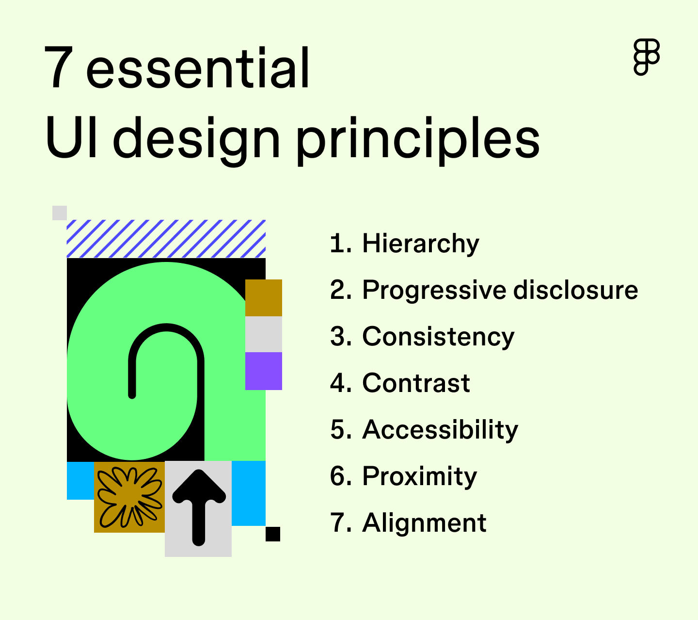
Key Ui/ux Design Principles For Modern Websites
1. Simplicity Is Powerful
Keep your design simple and clean. Too many colors, buttons, or animations can confuse users. Focus on what’s important for your business goals.
Example:
If you sell clothing, show clear product photos and an easy “Add to Cart” button. Avoid unnecessary pop-ups or moving banners.
Tips:
- Use 2-3 main colors only
- Keep text short and easy to read
- Use white space to make sections clear
A simple design helps your visitors focus on your products or services, not on flashy effects. For example, Apple’s website is very simple but highly effective. You don’t need to copy big brands, but you can learn from them.
In Bangladesh, many small business sites try to impress with moving text, many colors, and too many banners. This often makes the site look cheap and distracts visitors. Instead, choose a few key elements and let them shine.
Non-obvious insight: Simplicity also means fewer distractions for your customers. Remove anything that does not help your business goal (like old news, unused pages, or too many social media links).
2. Mobile-friendly Design
More than 70% of people in Bangladesh and across the world now use their mobile phones to browse the internet. If your website doesn’t work well on small screens, you will lose many customers.
How to check:
Open your site on your phone. Is the text big enough? Can you click buttons easily? If not, you need a responsive design.
Tips:
- Use large, touch-friendly buttons
- Stack content vertically for mobile
- Avoid small fonts or crowded layouts
A mobile-friendly website is not just about “shrinking” your content. It means redesigning parts of your site so they are easy to use with one hand. For example, menu buttons should be easy to tap, and forms should be easy to fill.
Example: A restaurant website might show a big “Call Now” button at the top on mobile, so customers can easily book a table. If you have a shop, make sure your “Add to Cart” button is big enough and not too close to other buttons.
Many beginners forget to test their websites on real devices. Don’t just use a simulator on your computer—borrow a friend’s phone and try every feature yourself.
3. Fast Loading Speed
People hate slow websites. Studies show that if your site takes more than 3 seconds to load, over 50% of visitors will leave. This is true in Bangladesh and everywhere else.
Tips:
- Compress images to make them smaller
- Use less animation and heavy scripts
- Choose a good hosting company
Every extra second your site takes to load, you lose more visitors. This is even more important in Bangladesh, where internet speed can be slower in some areas.
Example:
If your site has large photos of your team or products, use free tools like TinyPNG to reduce their size without losing quality. Also, avoid using too many plugins or add-ons, especially if you are using WordPress.
Non-obvious insight: Fast sites not only keep visitors happy—they also use less mobile data, which matters for users with limited internet packages.
4. Clear Navigation
Visitors should easily find what they are looking for. Your menu should be simple, and each page should have a clear purpose.
Example:
A business website might have these main menu items:
- Home
- Services
- Portfolio
- About Us
- Contact
Tips:
- Use short, clear menu names
- Keep the menu at the top
- Add a search bar for larger sites
Navigation is like a map for your website. If visitors get lost, they will leave. Use clear labels like “Contact” instead of “Reach Us” or “Portfolio” instead of “Our Amazing Work. ”
For e-commerce, use categories like “Men,” “Women,” “Kids,” instead of creative names that can confuse users.
Non-obvious insight: Always keep the most important links (like “Contact” or “Shop Now”) only one click away from the homepage. This reduces frustration and increases sales.
5. Strong Calls To Action (cta)
A CTA is a button or link that tells visitors what to do next: “Contact Us”, “Buy Now”, “Get a Quote”.
Tips:
- Use action words (“Book Now”, “Get Started”)
- Make the CTA button a bright color
- Place CTAs where people can see them easily
Example:
Onestopitbd. com uses clear CTAs like “Get a Free Consultation” on their homepage.
A good CTA stands out from the rest of the content. If you want more sales, don’t hide your “Buy Now” button. If you want more leads, put your “Contact Us” button at the top and bottom of every page.
Common mistake: Beginners often use weak phrases like “Submit” or “Send” for forms. Instead, use “Get a Free Quote” or “Start Your Project”—this tells users exactly what will happen.
6. Consistent Branding
Your logo, colors, fonts, and style should be the same on every page. This makes your business look professional and trustworthy.
Tips:
- Use the same logo size in all places
- Choose 1-2 fonts and use them everywhere
- Stick to your color theme
Branding is more than just your logo. It’s the “feel” people get from your site. For example, if your business is about healthcare, use calming colors like blue and green—not bright red or black.
If you change font sizes or button styles on every page, your site looks unprofessional. Choose a style and use it everywhere.
Non-obvious insight: Consistent branding also helps people remember your business. Even if they don’t buy now, they might come back later because your site looked “familiar.”
7. Easy To Read Content
People scan web pages—they don’t read every word. Help them by making your content clear and easy.
Tips:
- Use headings and subheadings
- Write short paragraphs (2-4 lines)
- Use bullet points for lists
Good UI/UX design means more than just pretty buttons. It also means writing in a way that is easy for everyone to understand, especially non-native English speakers.
Example:
Instead of:
“We are a leading provider of innovative technological solutions in the metropolitan area of Dhaka, Bangladesh, specializing in…”
Use:
“We offer IT solutions for businesses in Dhaka. Our team helps you grow with technology. ”
Non-obvious insight: Use simple, direct language. Avoid jargon or technical terms unless you explain them. This helps both local and international customers.
8. Accessibility For All
Your website should be usable by everyone, including people with disabilities.
Tips:
- Use good contrast between text and background
- Add alt text to images
- Make sure forms are easy to fill
Accessibility is often forgotten, but it’s very important. Some visitors have poor eyesight or use screen readers. For example, if your text color is too light, older users may not be able to read it. If your images don’t have alt text, screen readers cannot describe them to blind visitors.
Non-obvious insight: Accessibility helps your SEO, too. Google prefers websites that are easy for all users.
9. Trust-building Elements
Show that you are a reliable company.
Tips:
- Add client testimonials and reviews
- Show certificates or awards
- Display contact information clearly
Example:
One Stop IT Solutions adds real client reviews and a WhatsApp number for easy trust.
Trust is the key to online success. When people see real reviews, they feel safer. If you have worked with big brands, show their logos (with permission). If you are a member of a business group or have won awards, display these.
Non-obvious insight: Even a simple “About Us” story with your photo can build trust, especially for local businesses.
10. Seo-friendly Structure
A good website must also be easy for Google to read. This helps your business appear in search results.
Tips:
- Use keywords naturally in headings and content
- Write unique page titles and descriptions
- Add internal links between related pages
SEO is not just about adding keywords everywhere. Structure your site so each page has a clear topic, and link related pages together. For example, link your “Services” page to your “Contact” page with a call to action.
Common mistake: Beginners often copy content from other sites. Google will not rank duplicate content, so always write your own.
11. Local And Global Focus
If you want clients from Bangladesh and abroad, show that you can serve both.
Tips:
- Show local office address and phone number
- Mention international projects or clients
- Use English and Bangla if possible
A good UI/UX designer will help you decide what to show to local vs. international visitors. For example, display your Bangla phone number and address for local clients, but highlight your international shipping or English-speaking staff for global clients.
Non-obvious insight: If you serve both local and foreign clients, consider adding a language switch button and showing prices in both BDT and USD.
12. Analyze And Improve
Use tools to see how visitors use your site. Make changes if you see problems.
Tools:
Google Analytics, Hotjar, Facebook Pixel
Tips:
- Check which pages people visit most
- See where they leave your site
- Test different buttons and layouts
Improving UI/UX is not a one-time job. You need to keep testing. For example, if you see that many visitors leave your checkout page, try simplifying the form or adding a trust badge.
Non-obvious insight: Sometimes, small color changes or moving a button can increase sales. Always test your changes.
Real-world Examples
Example 1: Bangladeshi Business Website
A Dhaka-based electronics seller had an old, slow website. After updating the UI/UX with help from One Stop IT Solutions:
- Load time improved from 9 seconds to 2.5 seconds
- Mobile orders increased by 60%
- Average session time (how long people stay) doubled
Details:
Before the redesign, the website was using outdated code and very large images for product photos. The “Add to Cart” button was small and hidden below the product description. Many users left without buying because the checkout process had five confusing steps.
After the UI/UX update, the homepage had only the top-selling products, a big search bar, and a visible “Order Now” button. Product images were compressed, and the site used a modern, mobile-friendly theme. The checkout process was reduced to two simple steps.
Customer support chat was added at the bottom.
Result:
Customer complaints dropped, and the business got more repeat buyers. The owner noticed that even older customers (not just young people) started using the website more.
Example 2: International Client
A UK-based client needed a site for their export business. They wanted a modern look and easy navigation for non-English speakers. One Stop IT Solutions delivered:
- Clean, simple menu
- Multi-language support (English and Bangla)
- Easy quote request form
The client received 40% more inquiries within three months.
Details:
The original site was only in English, and the menu had too many options. Many visitors from Bangladesh and the Middle East found it hard to use. Also, the contact form was too long and asked for unnecessary information.
After the redesign, the site had a language switcher, and the main menu had only “Home,” “Products,” “About Us,” and “Contact. ” The contact form was reduced to three fields—Name, Email, and Message. A WhatsApp button was added for quick contact.
Result:
The company got new clients from Bangladesh and the Middle East. They also noticed that visitors spent more time reading about their products.
More Examples
Small Local Bakery:
A bakery in Chittagong had a Facebook page but wanted a simple website. They used One Stop IT Solutions to create a one-page site with:
- Large, clear pictures of cakes
- Easy “Order on WhatsApp” button
- Map showing the shop location
Sales increased, and customers found it easier to order custom cakes.
Freelance Service Provider:
A freelance graphic designer in Sylhet wanted to attract international clients. Their new site included:
- Portfolio with before-after images
- Simple contact form
- Testimonials from past clients
After launching, they got more projects from clients in the UK and UAE.
Data Table: Website Performance Before And After Ui/ux Improvements
Here’s a quick comparison of how UI/UX changes impact real business metrics:
| Metric | Before Improvement | After Improvement |
|---|---|---|
| Load Time (seconds) | 7.5 | 2.8 |
| Bounce Rate | 68% | 42% |
| Mobile Conversion Rate | 1.2% | 3.5% |
| Average Session (minutes) | 1.1 | 2.3 |
What do these numbers mean?
- Load Time: This is how many seconds your website takes to appear. Faster sites keep more visitors.
- Bounce Rate: This is the percent of people who leave after seeing just one page. Lower bounce rates mean people are finding what they want.
- Mobile Conversion Rate: This is how many mobile visitors become buyers or leads. A higher number means your mobile design works well.
- Average Session: Shows how long people stay. If people stay longer, they are more interested.
Non-obvious insight:
Even small improvements in these numbers can lead to big increases in sales or contacts. For example, reducing load time by just 1 second can increase conversions by 7-10%.
Common Mistakes To Avoid
- Using too many colors or fonts
- Not testing the site on mobile devices
- Hiding important information (like contact details)
- Using slow, heavy images
- Ignoring user feedback
More Details on Mistakes:
1. Too Many Colors or Fonts:
This makes your site look messy and unprofessional. Stick to a color palette and 1-2 fonts.
2. Not Testing on Mobile:
Many owners build their site on a computer and forget to test on phones. This leads to buttons that are too small or text that is hard to read.
3. Hiding Contact Info:
Some sites hide their phone number or email in a hard-to-find page. Always show your contact details at the top or bottom of every page.
4. Heavy Images:
Uploading large, uncompressed photos can make your site slow. Always resize and compress images before uploading.
5. Ignoring Feedback:
Your users can see problems you miss. Always listen to their complaints or suggestions.
Bonus Mistake:
Copying big brands without understanding why they work. What works for Amazon may not work for your local business.

Why Choose One Stop It Solutions?
Choosing the right partner for web design is crucial for your business success. One Stop IT Solutions stands out because:
- Trusted: Many local and international brands trust us.
- Affordable: We offer great value for both small and large businesses.
- Expert: Our team has experience in modern UI/UX, web development, and SEO.
- Supportive: We guide you step by step, from planning to launch and beyond.
- Results-Driven: We focus on real business growth, not just good looks.
Whether you need a simple site or a complex e-commerce store, we can help. Our solutions are always custom, never copy-paste.
Real Benefits Of Working With Experts
Personal Attention:
Unlike large agencies, we listen to your needs and offer suggestions based on your business goals. For example, if you want more leads, we focus on your contact forms and CTAs.
Up-to-Date Knowledge:
Web design trends change fast. What looked modern two years ago may look old now. Our team stays updated with the latest technology and design rules.
Local Understanding:
We know what works in Bangladesh and what international clients expect. For example, we can add mobile payments for local users or support for PayPal for foreign buyers.
After Launch Support:
Many web designers finish the site and disappear. We offer after-launch support—helping you with updates, backups, and even training your staff to use the website.
Transparent Pricing:
No hidden fees. You know what you are paying for. We offer packages for every budget.
What Our Clients Say
> “One Stop IT Solutions turned our outdated site into a modern store. Our sales doubled in six months!” – Local Shop Owner, Dhaka
> “The team understood our needs and delivered a website that works for both English and Bangla speakers. ” – Exporter, UK
Non-obvious insight:
Working with a local expert means better communication, faster updates, and a site that is truly made for your audience.
How To Start Improving Your Website
- Check your current site on mobile and desktop.
- Ask real users for feedback.
- List what you want to improve (speed, design, content, etc. ).
- Talk to UI/UX experts for advice.
- Invest in regular updates and testing.
Step-by-step Guidance:
1. Check Your Current Site:
Open your website on both a computer and different phones. Write down what looks good and what is confusing or slow.
2. Ask for Feedback:
Ask real customers, friends, or even staff to use your site and share their honest opinions. Sometimes, outsiders see problems you miss.
3. Make a List:
Decide what is most important for your business. Do you want more leads? More sales? Easier navigation? Set priorities.
4. Talk to Experts:
Contact a company like One Stop IT Solutions. A good designer will offer a free consultation and suggest practical changes.
5. Update Regularly:
Websites are not “set and forget. ” Update your content, check for broken links, and test features every few months.
Non-obvious insight:
Regular small updates are better (and cheaper) than waiting years for a big redesign.
Frequently Asked Questions
What Is The Difference Between Ui And Ux?
UI means how the website looks—buttons, colors, images. UX is about how it feels to use the site—easy or hard, fun or boring. Both are important for a good website.
Example:
A beautiful button (UI) is useless if people don’t know where it goes (bad UX). A simple menu (good UX) should also be easy to see and read (good UI).
How Does Ui/ux Affect Seo?
A good UI/UX helps your website load faster, keeps users happy, and makes information easy to find. Google likes these things, so your site can rank higher in search results.
Non-obvious insight:
Google measures user behavior. If many people leave your site quickly, your ranking drops—even if you have lots of keywords.
Can One Stop It Solutions Redesign My Old Website?
Yes! We can improve your site’s design, speed, and user experience. Our team will make sure your site looks modern and works well on all devices.
Tip:
We also offer a free site review. We will tell you what to fix first for the best results.
How Do I Know If My Website Needs A Ui/ux Update?
If users complain about confusion, slow speed, or leave quickly, you need an update. Also, if your design looks old or does not work well on phones, it’s time for a change.
Signs your site needs help:
- Fewer visitors or sales than before
- Site doesn’t open well on phones
- You get many questions about how to order or contact you
How Long Does It Take To Redesign A Website?
It depends on the size and needs of your site. Small sites can take 2-3 weeks, larger projects may take longer. We always discuss a timeline before starting.
Non-obvious insight:
A good designer will give you a clear timeline and update you regularly.
—
Ready to upgrade your business website and attract more customers—locally and globally? Work with One Stop IT Solutions, your trusted, affordable, and expert partner for web development and SEO.
👉 Website: [onestopitbd.com](https://onestopitbd.com)
👉 Email: Contact@onestopitbd.com
👉 Whatsapp: +8801914119584
For more on UI/UX design, you can also explore this UI Design Guide. Take the next step for your business today!